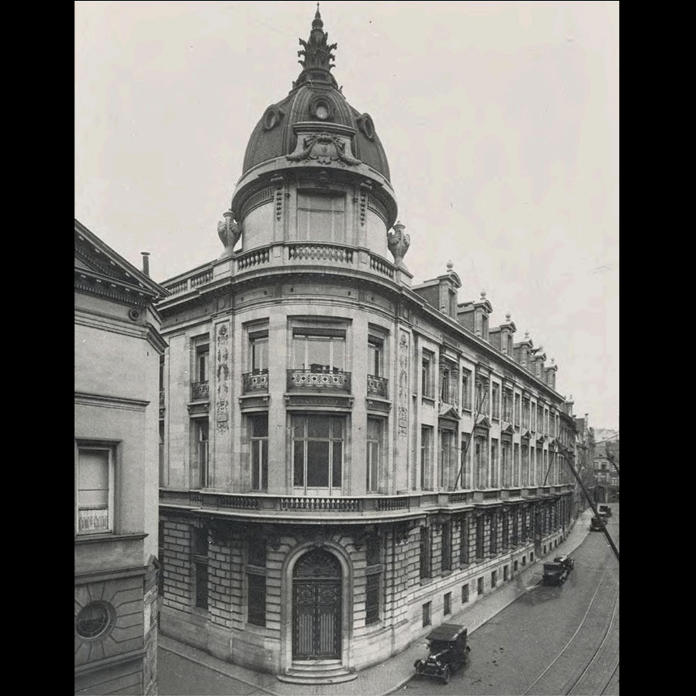
Hotel Fleur de Ville is set to transform the historic Chambon Building, a former 19th-century savings bank, into an exquisite boutique hotel in the heart of Brussels. This iconic neoclassical structure has provided us with a blank canvas to unleash our creativity. King of Hearts was tasked with creating the branding and communication design for the hotel, with the challenge of honoring the building’s rich heritage while infusing it with modern luxury and elegance, crafting a unique and captivating destination for guests.
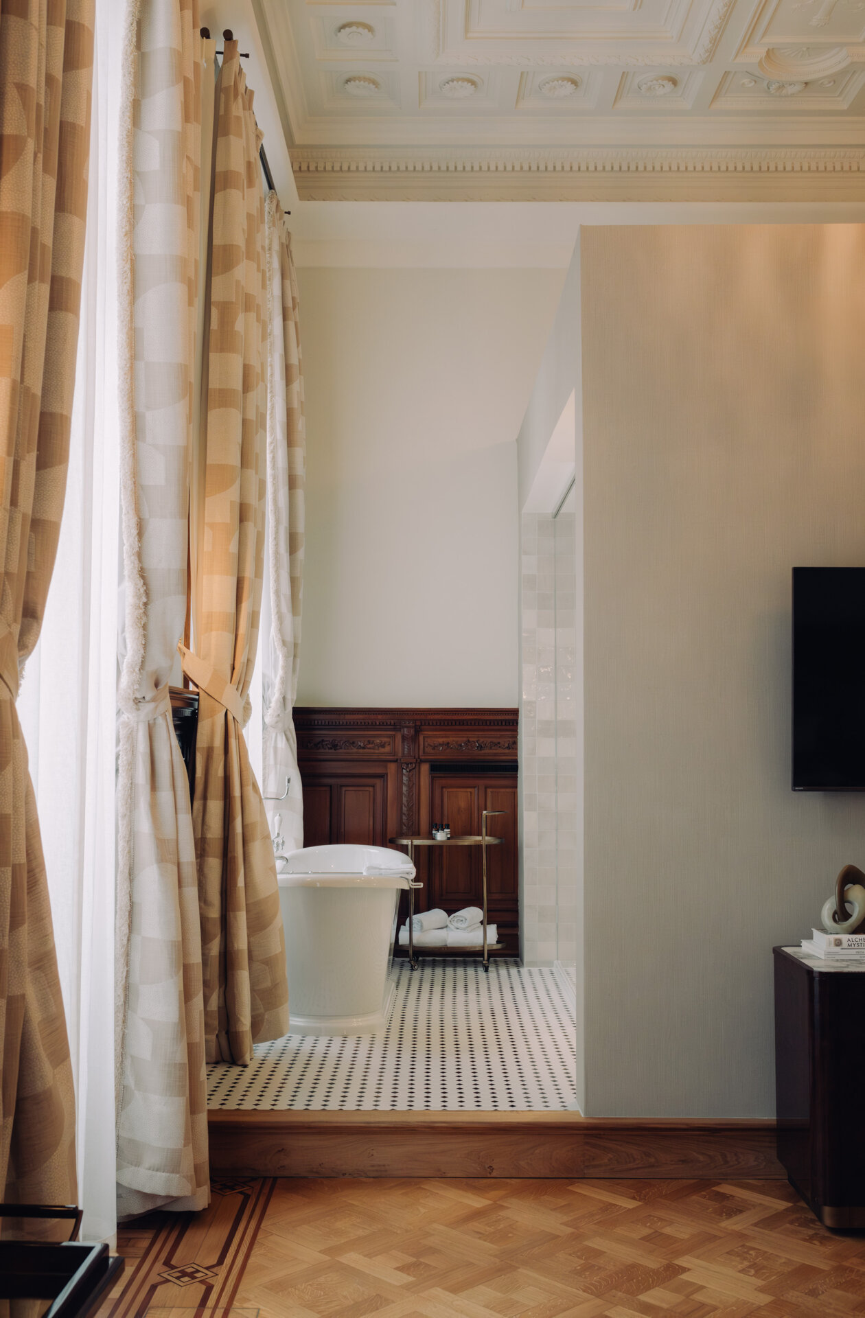
Drawing inspiration from the cinematic charm and vintage aesthetics of the building, we crafted an immersive design that pays homage to its storied past. Every detail, from the custom typography to the subtle color accents, was selected to evoke a timeless elegance and a sense of intrigue, reminiscent of stepping into a Hercule Poirot mystery. The hotel’s 51 rooms and suites, each with its unique character, seamlessly blend historical elements with contemporary comforts, offering guests a refined escape. Through meticulous interior design and thoughtful touches, Hotel Fleur de Ville invites guests to unravel its historical secrets while enjoying a luxurious and unforgettable stay.
The name ‘Fleur de Ville’ symbolizes a flower in a concrete world, literally Flower of the City. The city center of Brussels is hectic, and this flower represents a moment of slowing down and putting all your senses at ease. It is a discovery in both a literal and figurative sense. Once it catches your attention, you will never forget it.
The flower also attracts bees, which are represented throughout the ornamental and architectural details of the historic building. It’s like walking through an old city and stumbling upon a delicate, vibrant flower emerging from the cracks in the concrete pavement, captivating your attention with its exquisite beauty and fragile resilience.
The juxtaposition of the flower against the urban backdrop serves as a reminder of nature’s persistent presence and the potential for tranquility amidst chaos. Everywhere you go, subtle messages from the past can be found, revealing an intriguing layer of history from what was once a thriving business in the heart of roaring 19th-century Brussels.
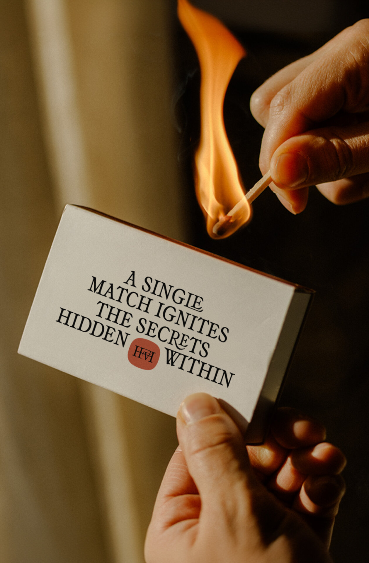
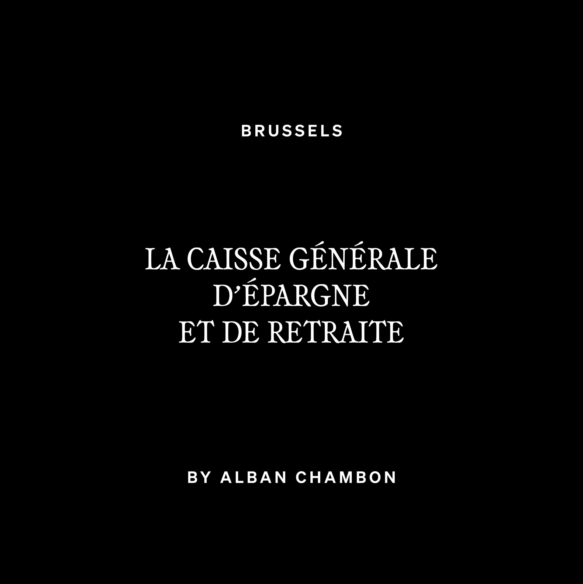
In honoring the craftmanship of yesteryears, our custom typography embodies meticulous attention and dedication. It is a deliberate choice in the identity, reflecting the zeitgeist of the past and symbolizes the commitment to timeless quality. A combination of ornamental letters set a contrast against the modern, more contemporary tone of voice; a literal interpretation of the hotel versus the bustling capital.
In honoring the craftsmanship of yesteryears, our custom typography embodies meticulous attention and dedication. It is a deliberate choice in the identity, reflecting the zeitgeist of the past and symbolizing a commitment to timeless quality. The combination of ornamental letters creates a contrast against the modern, more contemporary tone of voice — a literal interpretation of the hotel versus the bustling capital.
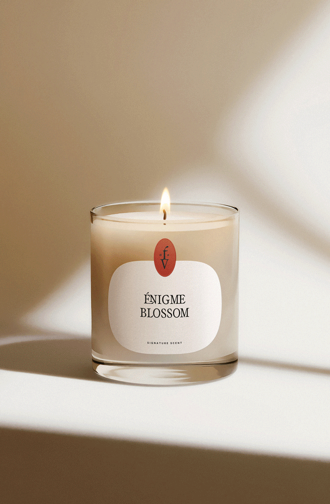
To harmonize with the classical surroundings, we introduce carefully curated touches of color that strike a delicate balance. Instead of bold, overwhelming flashes of light, we embrace subtle and elegant color accents that mimic the enchanting beauty of a vibrant little flower emerging from a crack in the concrete pavement. Incorporating a palette of colors not only adds visual interest but also establishes a connection to contemporary culture and the target audience, seamlessly blending the past with the present.